Case study
Myke Consult
A website that makes a four-arm finance and strategy consultancy look as established as it is, and gives every visitor a clear route to a consultation.
- Client
- Myke Consult
- Role
- Team Lead
- Year
- 2025
- Stack
- Next.js · TypeScript · Tailwind CSS
- Live
- mykeconsult.com
01 — The problem
Four businesses, one front door.
Myke Consult is really four businesses under one name, covering finance, technology, investment and project delivery, with offices in Uyo and Lagos. Its clients range from government agencies to banks to private companies.
A firm that broad is hard to explain through referrals alone. Without one place that tells the whole story, a client who knows Myke Consult for tax work may never find out about its investment or software arms. A bank or government agency weighing it up would also have nothing to check before getting in touch. The website had to fix both problems: show the full range of the firm, and put its track record and partners where a cautious client would see them first.
02 — Who it serves
Built for decision-makers.
Businesses
Companies that need tax, accounting, audit or financial software. They find the right service fast and get one clear route to a consultation.
Institutions
Government and banking clients who look for evidence before they call. They're met with 15+ years of experience and logos such as AKIRS, Wema Bank and IPDC.
Professionals
People looking for training, which has its own page instead of being buried among the consulting services.
03 — The product
Six pages, one goal.
- 01
A clear hero
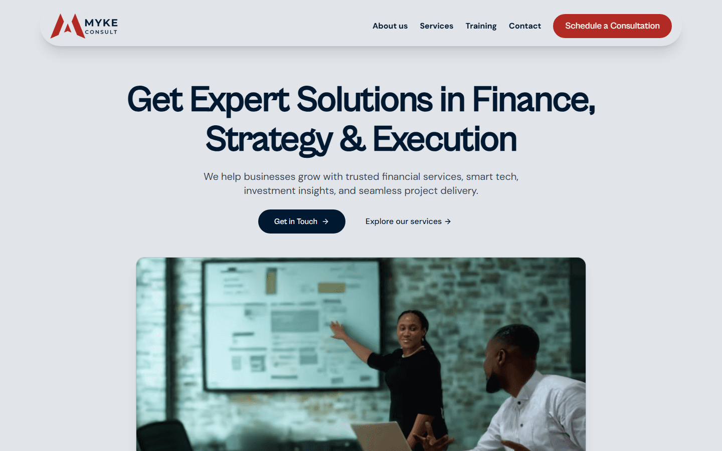
One headline sums up what the firm does: finance, strategy and execution. It's followed by two actions, getting in touch or exploring the services.
- 02
Proof up front
Right after the hero come the firm's track record and a strip of partner logos, so trust is built before any selling starts.
- 03
Services at a glance
Six service cards cover financial consultancy (with its seven specialisms), investment, business development, financial software, project management and training.
- 04
Every path leads to contact
"Schedule a Consultation", "Get in Touch" and "Speak with an Expert" all lead to the same contact page, so no visitor hits a dead end.
- 05
Two offices, findable
The footer on every page gives both the Uyo head office and the Lagos office, with their phone numbers and email addresses.
- 06
Light on mobile data
Images are served as resized WebP files through Next.js, so pages load quickly on a phone connection.
04 — My role
What I owned.
As team lead on Myke Consult's software, I built most of the site's interface myself: the navigation with its dropdown and mobile menu, the hero and track-record stats, the partner logo strip, the call to action and the footer with both offices.
I worked with Chenst Management Systems, the studio credited as the site's developer. They set up the project's foundation, and I built the page sections on top of it.
05 — The hard parts
Where the real work was.
One brand, not four
Finance, technology, investment and project delivery could easily have become four separate mini-sites. Instead, every arm sits in one service grid, uses the same visual language and leads to the same contact page. A visitor who came for one service can see all the others at a glance, and the firm comes across as one company with real range.
Components that stay tidy
Each section of the page lives in its own folder, and its content sits in a data file next to the component that lays it out. Updating a service, a statistic or a partner logo means editing a list, not digging through layout code. That keeps changes quick and low-risk as the firm grows.
Built for phones first
Many clients will first see the firm on a phone, so the navigation collapses into its own mobile menu. Images go through Next.js image optimisation, which serves small, modern files instead of full-size photos, so the site stays quick on mobile data.
06 — Results
At a glance.
- 4business arms under one brand
- 10partners, from AKIRS to Wema Bank
- 1clear path from any page to a consultation
Building for a client taught me that the website isn't the product; the client's reputation is. Every choice came back to one question: would a cautious bank or government buyer trust this firm after thirty seconds on the page? Next, I'd like to add online booking, so a visitor can schedule a consultation straight from the site instead of going through the contact page.